
A floor is the one thing in your home you can’t easily change your mind about.
Paint takes a weekend. A sofa can go. A floor stays put for twenty years — and by the time you know whether you chose well, it’s far too late to swap it.
So here are ten porcelain tile floors worth a look, and what each one is really like to live with. Which ones hide the dirt. Which ones turn slippery when wet. Which ones quietly cost you more tile than you planned for.
A note on names, because it trips people up. Porcelain is classified under ISO 13006 and EN 14411 as BIa — a dense body with water absorption at or below 0.5%. In India and parts of South Asia the same product is sold as vitrified tile. The abbreviations differ; the physics doesn’t. If a supplier can’t produce the water absorption figure, treat the word on the box as a suggestion rather than a fact.
Good looks are the easy part. Pick a floor that still works on a wet Tuesday morning.
First, a 60-second primer on the categories
Showroom staff will throw four acronyms at you. Knowing them saves money.
| Type | What it is | Best for | Watch out for |
|---|---|---|---|
| Glazed porcelain | A porcelain body with a digitally printed glaze layer on top | Almost everything — by far the widest design and finish range | A deep scratch or chip exposes a different body colour underneath |
| Colour-body porcelain | A glazed tile whose body is tinted to match the main glaze pigment | Busy floors where a chip would otherwise stand out | Slightly pricier than standard glazed; the body is one flat colour, not the surface pattern |
| Polished porcelain | A glazed tile mechanically polished to a mirror gloss | Formal living rooms, hallways, feature walls | Slippery when wet; shows scuffs and footprints |
| Double-loaded porcelain (double-charged) | Two layers of pigment pressed 3–4 mm deep, with no printed glaze | High-traffic floors, lobbies, staircases | Limited to simpler patterns and solid tones |
| Full-body porcelain (through-body) | Unglazed, with colour running uniformly through the whole tile | Commercial-grade durability — chipped edges stay invisible | Costs more, fewer designs, and usually wants periodic sealing |
Two more numbers worth memorising. PEI 4–5 is the abrasion class you want for any floor that sees shoes or children. For slip resistance anywhere water lands — bathrooms, patios, kitchen edges, pool surrounds — look for R10 to R11 under DIN 51130, or a DCOF of 0.42 or above under ANSI A137.1.
What it costs
Porcelain spans an enormous range, and format, finish and construction move the price far more than brand does. Tile only, excluding adhesive, labour and wastage:
| Tier | US (per sq ft) | UK (per m²) | What you get |
|---|---|---|---|
| Budget | $1–3 | £15–25 | Builder-grade, standard formats, plain matte finishes |
| Mid-range | $3–7 | £25–45 | Most stone-effect, wood-effect and concrete-look ranges |
| Premium | $8–15+ | £50–120 | Large-format, rectified, book-matched slabs, designer ranges |
Installed, including labour and materials, a standard porcelain floor typically runs $15–25 per sq ft in the US, though the full spread across simple to complex jobs is roughly $9–50. In the UK, mid-range installations commonly land around £100–130 per m² all-in, with premium and large-format work reaching £150–250+. Labour alone is usually $8–15 per sq ft in the US and £30–60 per m² in the UK.
Outdoor-grade porcelain costs more because it’s thicker and slip-textured — budget £25–60 per m² in the UK, and expect a similar step up in the US.
Prices vary considerably by region, supplier and season, and complex layouts add 15–25% to labour, so treat these as planning ranges rather than quotes. Always get two or three competitive bids against your actual spec.

1. Marble-look polished porcelain: the luxury floor without the maintenance
This is the biggest single shift in residential flooring. Statuario, Carrara, onyx and Botticino veining printed onto a porcelain body delivers the drama of Italian marble without the anxiety.
Real marble is calcium carbonate. Lemon juice, vinegar, tomato, wine and most acidic cleaners etch it permanently — and a kitchen runs on exactly those ingredients. Porcelain doesn’t etch, doesn’t need sealing, and never needs re-polishing.
- Sizes: 32 × 64 in. (800 × 1600 mm) and 48 × 72 in. (1200 × 1800 mm) read best. The larger the tile, the more the veining looks quarried rather than printed.
- Buy vein-matched sets. Cheap ranges repeat the same three or four faces across a whole room, and the eye catches it instantly.
- Cost: mid to premium — roughly $3–10 per sq ft, or £30–70 per m². The large book-matched formats sit at the top of that.
- Reality check: polished porcelain in a wet entryway is a fall risk. Keep gloss for dry zones.
2. Wood-effect plank tiles, in the new darker palette
Solid hardwood and engineered timber struggle with moisture and seasonal movement — cupping in humid coastal climates, gapping through a dry winter with the heating on. Wood-effect porcelain planks give you the warmth without the movement, and they can be wet-mopped, which no timber floor enjoys.
Current manufacturing embosses the surface in register with the printed grain, so you feel the rise and fall of the wood underfoot. Formats run from 8 × 48 in. up to 8 × 72 in. (200 × 1200 mm to 200 × 1800 mm).
The palette has turned. Pale Scandinavian ash and whitewashed oak are giving way to warm walnut, aged oak and smoked timber tones — part of a broader move back toward warmth.
- Lay in a 1/3 offset, not a 1/2 brick bond. A half-offset on long planks accentuates any lippage and can read as a sag along the run.
- Match grout to the mid-tone of the plank, never to the darkest grain line.
- Best rooms: bedrooms, study, home office, kids’ rooms.
3. Terrazzo-look tiles for a floor that hides real life
Terrazzo has been fashionable since fifteenth-century Venice and shows no sign of leaving. In tile form it solves a very practical problem: a speckled, chip-flecked surface disguises dust, footprints and pet hair between cleans far better than a plain floor.
Two directions work:
- Fine, low-contrast chips in warm greige — a quiet neutral that behaves like a solid floor from standing height.
- Bold, large-aggregate chips in a single accent room — a powder room, a landing, a home bar.
Keep large-chip terrazzo to one zone. Across a whole house it becomes visually noisy fast.
4. Concrete and micro-cement looks for minimalist open plans
A matte grey or greige concrete-look porcelain running unbroken from entry hall through living and dining to the kitchen threshold is the quietest way to make a compact home feel larger. No pattern changes, no thresholds, no visual noise.
- Sizes: 48 × 48 in. (1200 × 1200 mm) or 24 × 48 in. (600 × 1200 mm).
- Grout: tone-on-tone with the tile. This is non-negotiable — contrasting grout destroys the monolithic effect.
- Specify rectified tiles, cut to within 0.5 mm tolerance after firing. Only rectified edges allow joints as fine as 1/16 in. (1.5–2 mm). Non-rectified tiles need 1/8–3/16 in. (3–5 mm) joints and the seamless look collapses.
- Cost: mid-range for standard formats, roughly $3–7 per sq ft or £30–50 per m². Rectified edges and the biggest formats push toward premium.
5. Textured anti-slip tiles wherever water lands
Not a style idea so much as the one that prevents an emergency-room visit.
Specify R10 as a minimum for bathroom floors, R11 for patios, balconies, entrances and utility areas — or check the DCOF value is 0.42 or higher. In smaller formats, 12 × 12 in. or 24 × 24 in. (300 × 300 mm, 600 × 600 mm), the extra grout lines are an asset: they add grip and make it easier to fall the floor toward a drain.
A good trick: use the same design family in a matte anti-slip version for the wet zone and a smoother version elsewhere, so the visual language stays continuous while the safety changes exactly where it needs to.
One caution against overcorrecting — the higher the grip, the more texture, and the more texture, the more grime settles into it. R12 in a domestic bathroom is over-specified and will need scrubbing rather than wiping.
6. Patterned encaustic tiles as an accent, never a whole floor
Moroccan zellige, Portuguese azulejo and Victorian encaustic patterns have moved from novelty to standard specification — but only in defined pockets:
- The entry hall, as a “welcome mat” that stops at the living room edge
- A powder room floor and skirting
- A boot room, mudroom or utility
- Under a kitchen island, or in a hearth surround
Two rules keep it from ageing badly. Pick one pattern for the house, not three. And ground it with plain flooring on all sides, so the pattern reads as intentional framing rather than leftover stock.
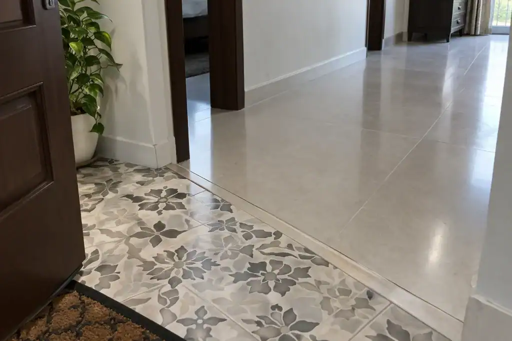
7. Charcoal and deep-tone full-body tiles
Dark floors have come back, and they give a room something pale floors can’t — a base, a weight at the bottom, so everything above reads lighter and more deliberate. But of all ten ideas here, this is the one where construction and finish matter most.
Buy full-body, not printed glaze
- On a glazed tile the colour sits in a thin surface layer. Drop a cast-iron pan and you don’t get a chip — you get a pale scar in the middle of a dark floor, and there’s no fixing it.
- Full-body porcelain carries pigment all the way through, so the same knock just exposes more charcoal. You’ll know it happened; a visitor won’t.
- This is why full-body is the only sensible choice for stair treads, where edges take the most abuse and a chipped nosing sits at eye level.
Go matte, not polished
- Dark floors report everything: dust, hair, lint, the pale ghost of a dried water drop, and the streaks a dry mop leaves behind.
- They aren’t dirtier — they just show what a mid-tone floor hides. The finish does the heavy lifting.
- Matte or lightly textured hides several times more than polished. Polished charcoal shows every footprint an hour after cleaning, and turns slippery the moment it meets water.
Check the undertone before you commit
- Warm charcoal with a brown or bronze cast sits comfortably with timber and warm lighting.
- Cool blue-grey charcoal can feel severe in a north-facing room with little sun.
- The two look nearly identical on a sample and completely different across a whole floor.
Decide the grout deliberately
- Matching dark grout keeps the floor reading as one continuous plane — usually the point of a dark floor.
- Pale grout turns it into a grid. Striking in the right room, but it’s also a bright line that shows every bit of grime.
Where it works
- Best in dining rooms, media rooms, formal sitting rooms and stairs — places where the drama pays off and traffic isn’t relentless.
- Pair with pale walls and warm timber furniture, or the room closes in.
- A dark floor in a busy family kitchen with a dog is a commitment, not a design choice.
8. Floor-to-wall continuity with book-matched slabs
Large-format slabs — 48 × 96 in. (1200 × 2400 mm) — let the floor material climb the wall. Two mirrored slabs open like a butterfly to form one continuous veining pattern.
Where it earns its cost:
- Bathrooms, where running the floor tile up the wet wall removes joints and makes a small room feel carved from a single block.
- A living room media wall, book-matched behind a floating console.
- Kitchen splashbacks, using the same slab as the counter for a fully monolithic run.
Slabs need experienced installers, suction-cup handling and a perfectly flat substrate. Budget for the labour, not just the tile.
9. Zoning with tile “rugs” and metal inlay strips
Open-plan homes lose definition. Rather than adding a rug that has to be cleaned, define zones in the floor itself:
- A rectangle of patterned or contrasting tile under the dining table, framed by a border, so the dining area reads as its own room.
- Brass or matt-black metal strips set into the joint where one tile type meets another. It’s a clean, deliberate transition and reads far better than a butt joint between two finishes.
- A tile-in-tile “carpet” in the entryway, sized to the actual door swing.
Plan these at the drawing stage. Cutting a border into a laid floor afterwards is expensive and rarely lines up with the room.
10. Indoor-to-outdoor continuity for patios and terraces
Use the same design in two grades: a smooth interior finish inside, and a 3/4 in. (20 mm) outdoor-grade version with R11 texture on the patio, terrace or balcony. Visually the floor continues; functionally it changes exactly where it should.
The eye reads it as one uninterrupted plane, which makes both spaces feel bigger — a meaningful gain where the patio is the main outdoor room. Fall the outdoor section roughly 1:100 (about 1/8 in. per foot) toward the drain, and keep the outdoor level a few millimetres below the interior finish so rainwater never travels inward.
Choosing by room: a quick reference
| Room | Type | Finish | Format |
|---|---|---|---|
| Living / dining | Glazed or full-body | Matte or satin | 24 × 48 in., 48 × 48 in. |
| Formal sitting room | Polished porcelain | High gloss | 32 × 64 in. |
| Bedrooms | Wood-effect glazed | Matte, embossed | 8 × 48 in. planks |
| Kitchen | Full-body or double-loaded | Matte, R10 | 24 × 24 in., 24 × 48 in. |
| Bathroom | Glazed porcelain | Matte, R10–R11 | 12 × 12 in., 24 × 24 in. |
| Patio / terrace | Outdoor-grade porcelain | Structured, R11 | 24 × 24 in., 3/4 in. pavers |
| Staircase | Full-body | Matte with nosing groove | Cut to riser |
Five things that go wrong (and how to avoid them)
- Shade variation between batches. Tiles are fired in lots, and lots differ. Order your full quantity plus wastage in a single batch, note the batch number, and keep the leftovers boxed for future repairs.
- Hollow tiles. Dab-and-dot adhesive leaves voids that crack under point loads. Insist on full-bed coverage with a notched trowel — around 95% coverage for large formats. Tap-test a sample area before final payment.
- The wrong adhesive. Large-format porcelain won’t hold on ordinary sand-cement mortar. Specify a polymer-modified adhesive — C2-class under EN 12004, or ANSI A118.4 / A118.15 modified thinset.
- Cheap cement grout. It stains, absorbs pigment from spills and greys within a year. Epoxy grout costs more upfront and is genuinely worth it in kitchens and bathrooms.
- Gloss in the wrong place. Polished porcelain plus wet feet is a slip hazard. Save it for dry, low-traffic rooms.
Care that keeps the floor looking new
Porcelain is close to zero-maintenance, but a few habits help:
- Dry-sweep before wet-mopping. Grit dragged across a polished surface is what creates the fine scratch haze people mistake for wear.
- Use a pH-neutral cleaner. Acidic cleaners attack cement grout even though they leave the tile untouched.
- Skip wax and floor polish entirely. It builds a film, traps dirt and makes the floor slippery.
- Put decent mats at every external door. Most abrasion arrives on the soles of shoes.
- Check grout lines annually in wet areas and re-point any that have opened.
The short version
Choose the type for durability, the finish for safety, and the design for looks — in that order.
Which means two tiles sitting side by side, both labelled “vitrified,” can behave differently in a wet bathroom or on a frost-exposed balcony.
So ask for the water absorption figure rather than trusting the word on the box. Any serious supplier can produce it. If nobody can tell you the number, treat the label as a suggestion. One question, no cost, and it’s the most useful thing you can say in a showroom.
If the tile families themselves are still fuzzy, we’ve untangled vitrified vs ceramic tiles separately.
Picking one
The floors that still look good in five years aren’t the boldest. They’re the ones matched honestly to the room, the household, and the person laying them.
If you want something that disappears and behaves, look at large format, concrete-look or terrazzo. If you want warmth, wood-look planks. If you want the floor to be the feature, herringbone or a dark tone — and go in knowing what each costs in upkeep and material.
Then settle the layout before you order anything, because the pattern, not the tile, usually decides how much you end up buying.
